Design
Choosing a Cake Colour Palette You'll Still Love in Photos
8 April 2026 · 5 min read
A simple, painterly way to choose three colours that will make your cake feel timeless on the day and in the album.
Cake colour is one of those decisions that quietly carries the whole design. Too bright and it fights the room. Too pale and the cake disappears in photos. The sweet spot is almost always somewhere painterly.
Pick three, not seven
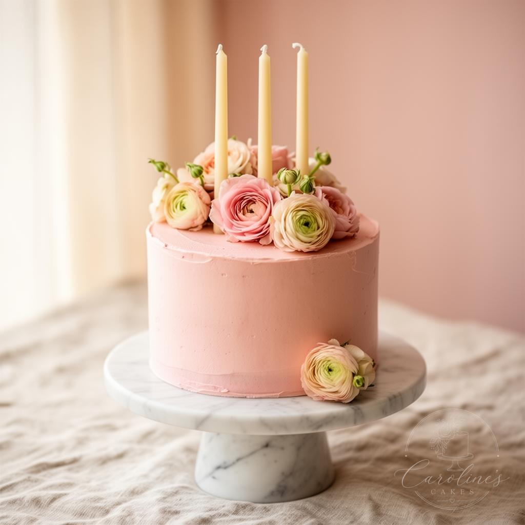
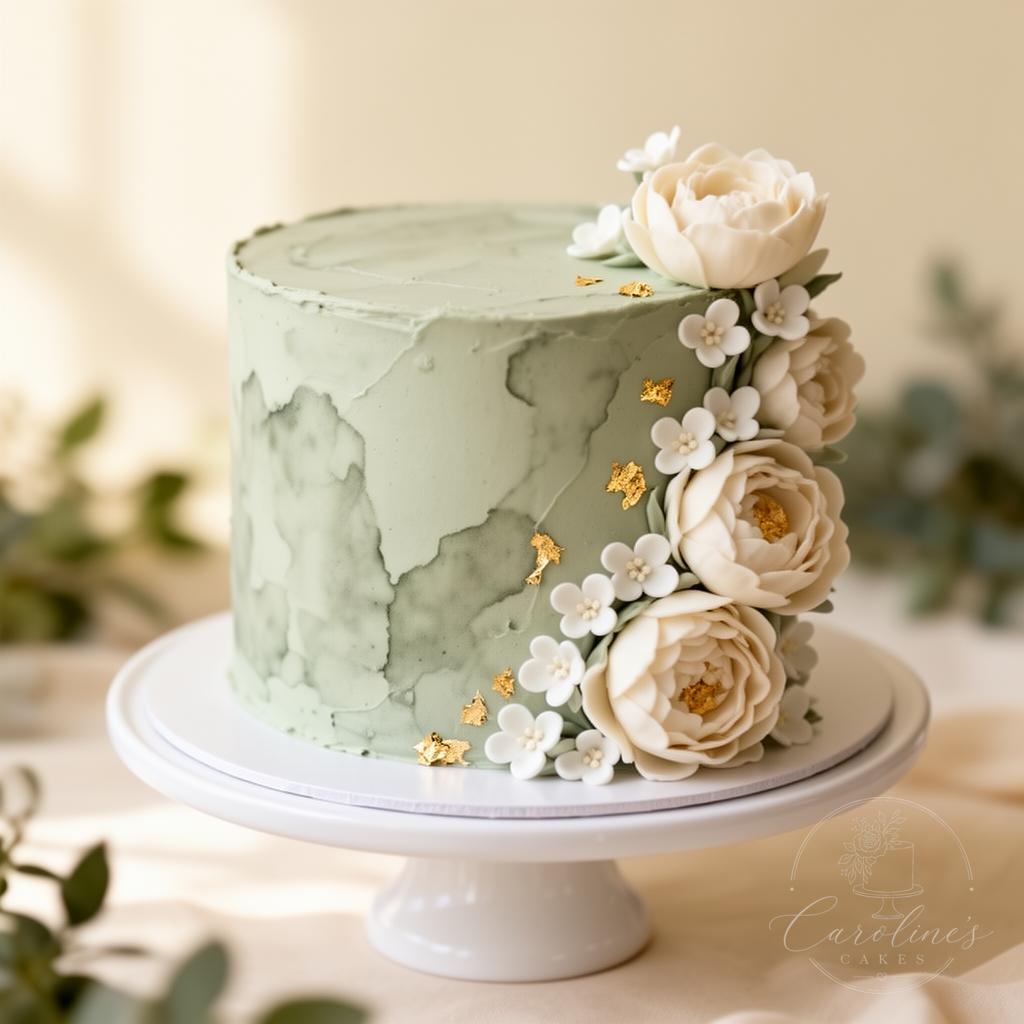
A confident cake palette is almost always built on three colours — one soft base (ivory, cream, blush), one quiet anchor (sage, dusty blue, terracotta) and one tiny accent (gold leaf, burgundy, deep navy). Anything more and the cake starts to feel busy.
Palettes that always photograph beautifully
- Ivory, sage and gold — soft, garden, timeless
- Blush, cream and burgundy — romantic and warm
- Dusty terracotta, peach and ivory — boho-elegant
- White, dove grey and a single pop of fresh greenery
Test it under real light
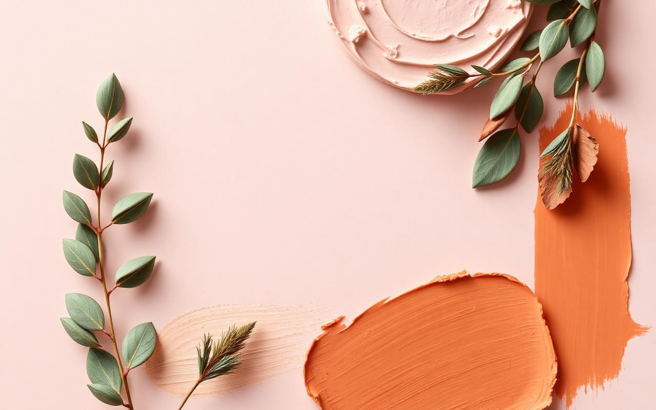
Buttercream colour shifts under different light. A blush that looks lovely in your living room can read peach under warm restaurant lights or grey under a marquee. A good baker will paint a small test swatch and check it under the actual event lighting where possible.
Choose colours the way you'd choose paint for a room you'd live in for years.